


EXAMPLE OF FEATURE
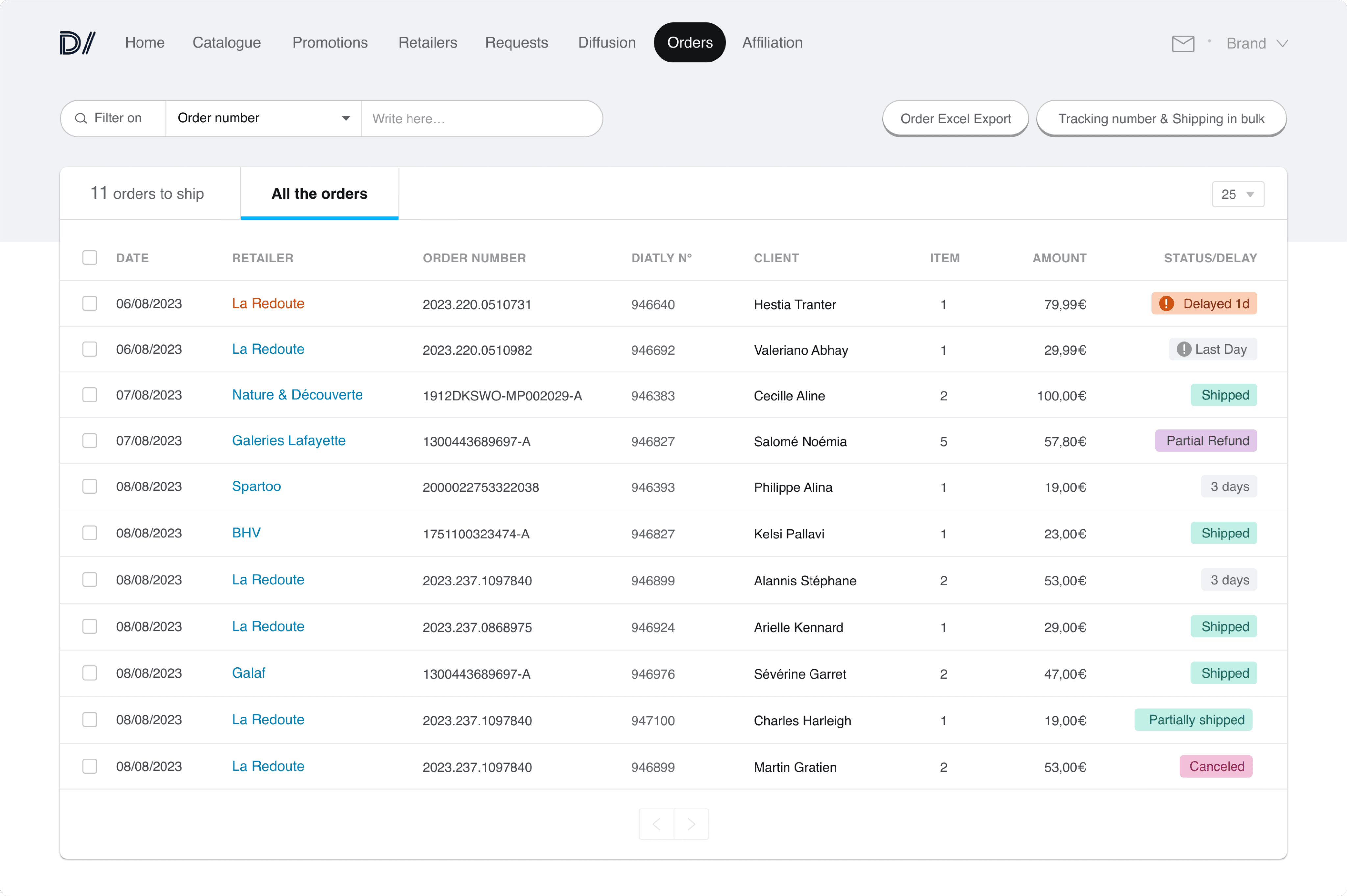
When an order is placed on a marketplace, it is sent to the brand via a funnel with several steps. The order may be stuck in any of these steps. In this case, the brand will not be able to ship the order correctly, or at all.
Even a seemingly small error by the buyer can create an issue (e.g. an impossible post-code, but yet accepted by the marketplace interface, can be refused by the brand system receiving their orders).
One of our major pain points was that the brands were noticing problems with their orders before we were, which is not a good client experience.
We visualized the complete funnel with the support team and the developpers, and designed a solution where the team is pro-active and can resolve any issue without the brand even noticing.
The clients of eTAIL were brands selling a range of goods online: from clothes to beer, from pet food to gym equipment.
Initially started as a SaaS, the company provided a tool for brands to be fully autonomous.
But as larger clients were onboarded, the company had to shift to provide services dedicated to brands.
Working with these type of clients meant dealing with different levels of expectations and mostly different requirements. Brands were divided in 2 categories:
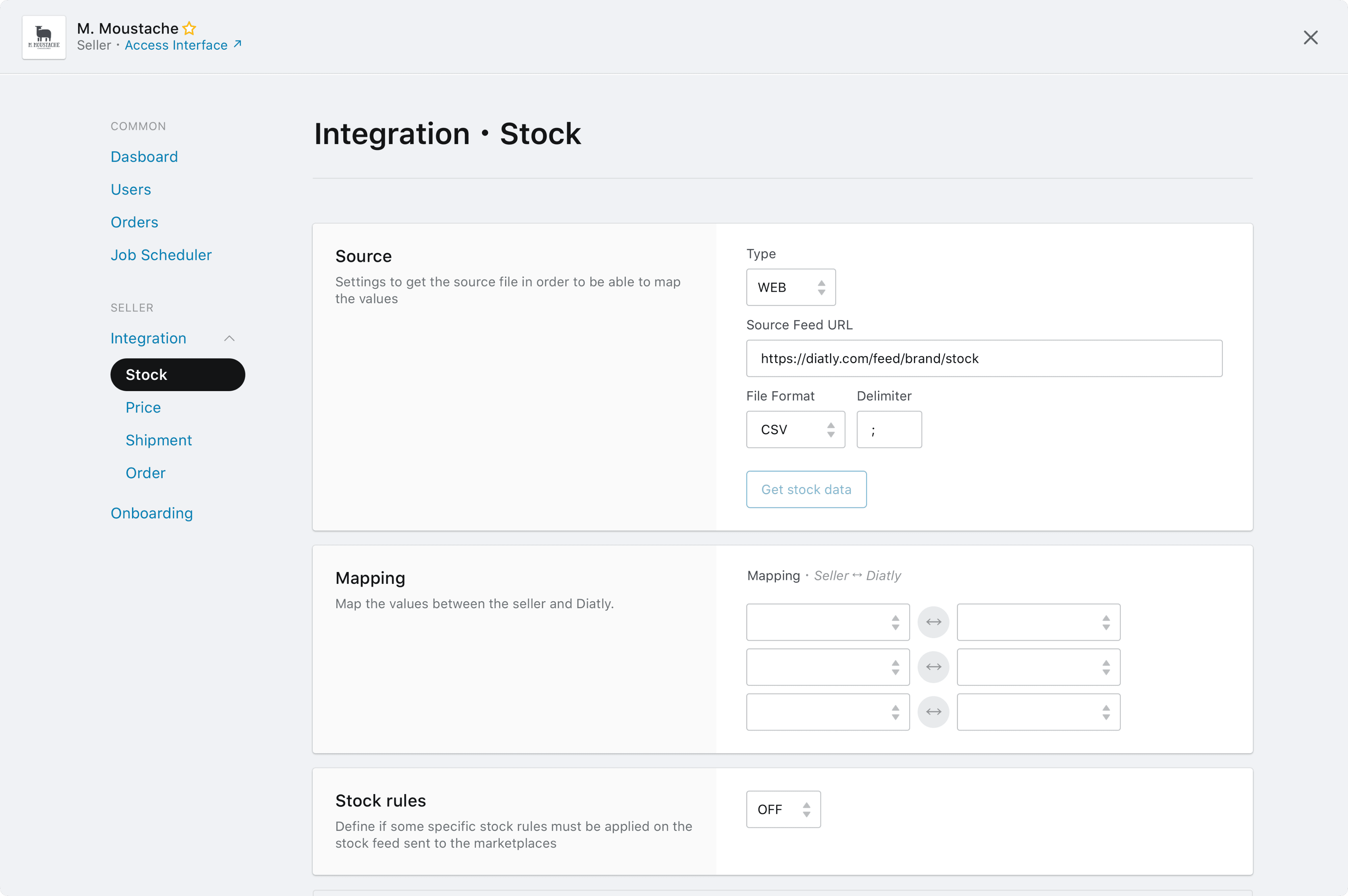
Brands using their own system but requiring some dedicated feeds of data to operate their marketplace distribution.
The work with these brands was more technical (PO) than design based. These clients did not have a dedicated interface but the work was instead done by the account managers in the dedicated back office (process described above).
Brands using the interface developed by eTAIL, providing tools and information about their marketplace distribution.
The majority of brands used the interface made by eTAIL. Their relationship was very strong with the design and product team. The features provided by the tool were adapted to each marketplace, and even sometimes unique in the ecosystem.
Open communication with brands created an efficient feedback loop that allowed for new requests to be continually submitted for analysis. Bugs could be quickly fixed and larger requests were carefully considered for the roadmap.
This was not just good client service and user experience, but also a way to align and refine our product development.
Designing in this environment meant understanding the needs, communicating effectively, iterating fast and testing fully to deliver new features within acceptable timelines.

EXAMPLE OF feature
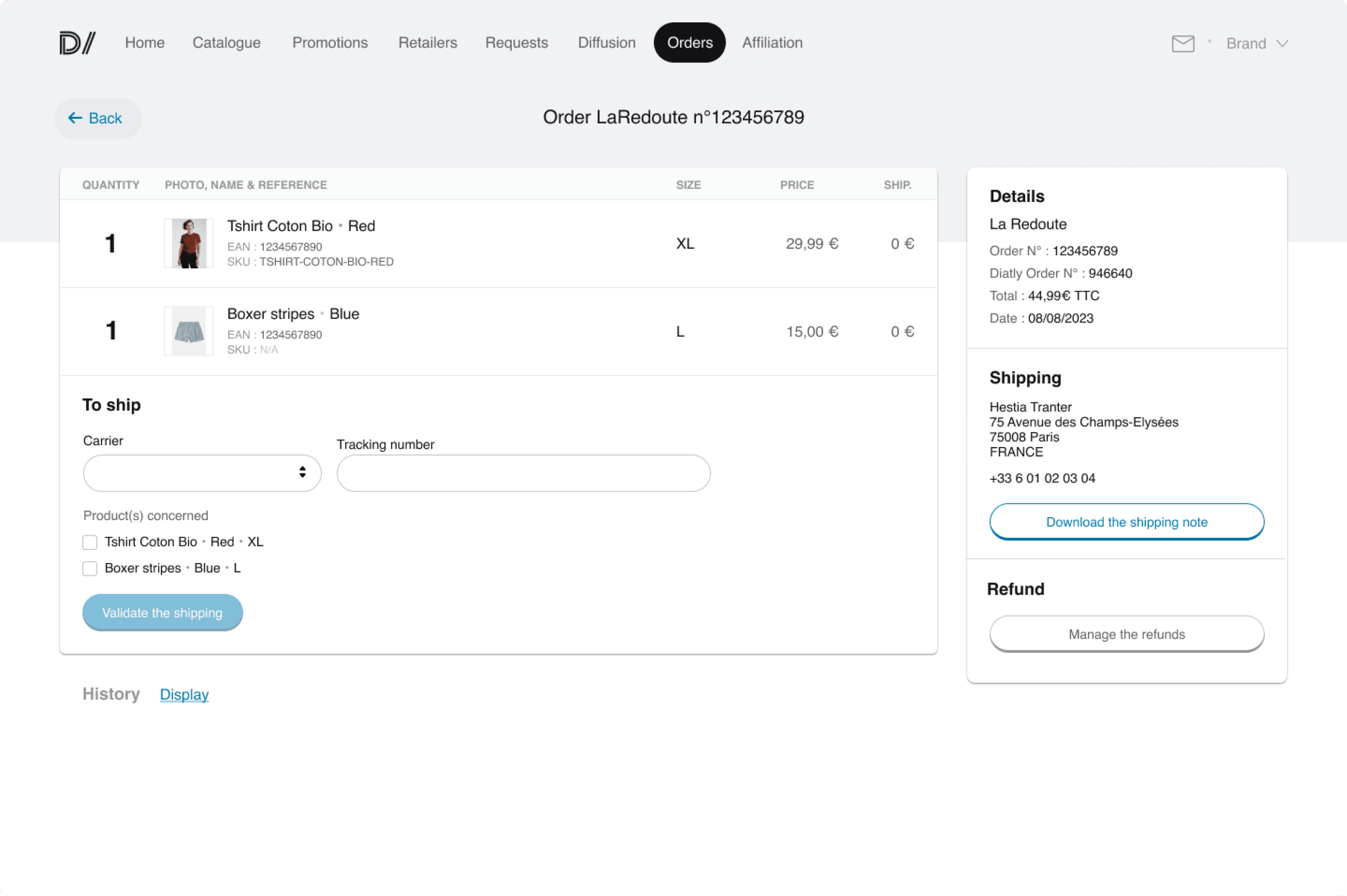
With time and effort, some small brands started to sell a lot of products once they were integrated in marketplaces. They were used to sending a few orders per week but were then faced with a much higher output.
A fully automated solution was one of the services provided by eTAIL but it did not fit the budget of most smalls brands. On the other hand, managing shipping manually on the original interface was very time consuming, especially during seasonal sales like Christmas or BlackFriday. A client selling well could spend a day just to update the shipping details.
The small brands represented a large percentage of clients, so an efficient solution had to be found to help them expedite the process.
Following discussions with clients and the technical team, the chosen solution was to create a download/upload file system. It should:
Allow the brand to download an orders file with all the orders waiting to be treated
Allow the brand to upload that same file with the shipping details included and update the orders all at once on our system
An existing internal tool was already in use by the client support team and could help us simulate the final tool. It was natural to actively involve them in the initial analysis phase with the clients.
A few brands with different shipping carriers were selected and a process was set: the team would send the file to the brand, they would fill it with the shipping details and the team would upload it to update the orders.
There were no alerts if orders had issues.
The update was blocked as soon as an issue was found in the upload file.
Some carriers had very specific fields that were not included in the file.
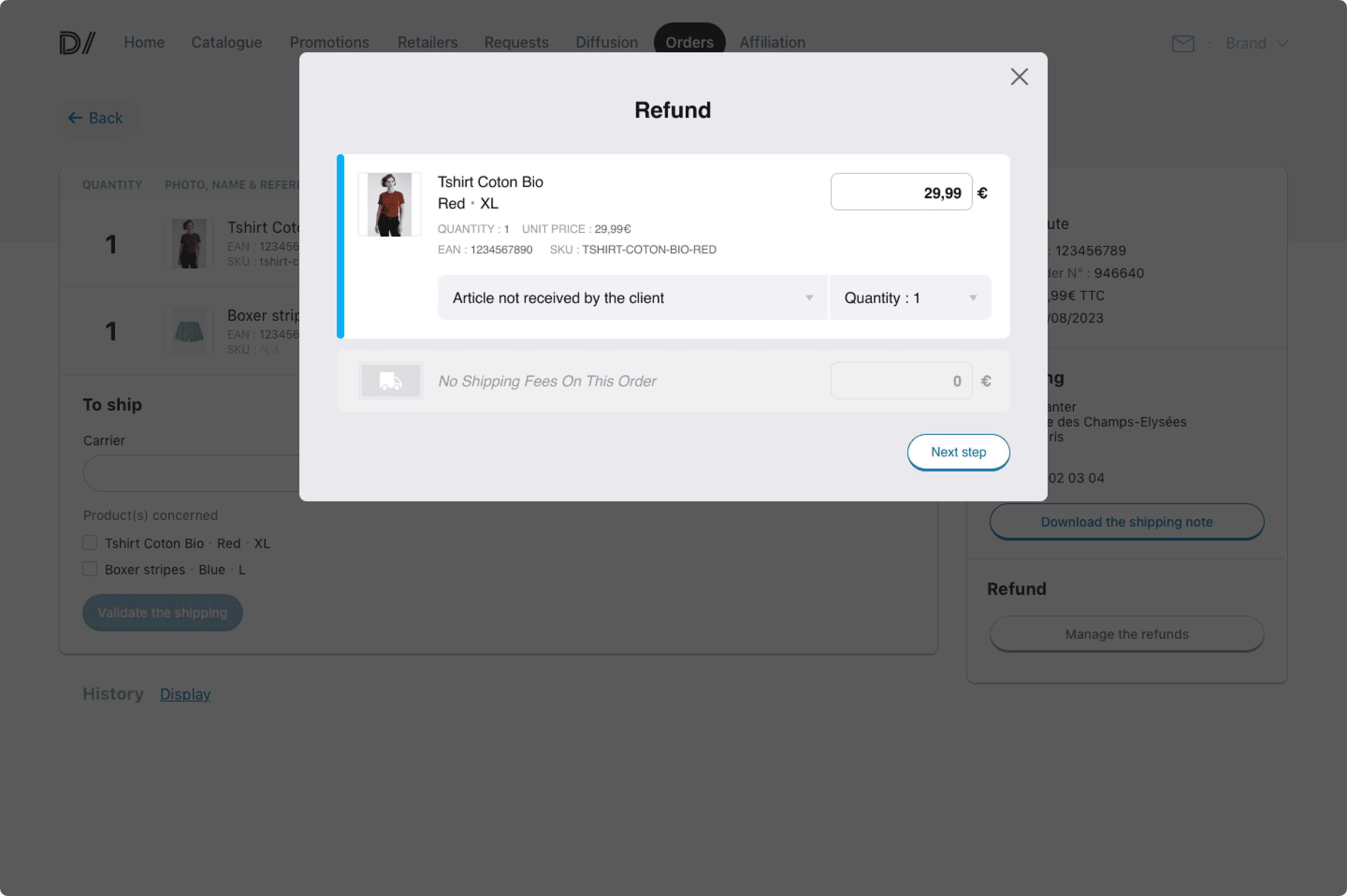
Based on these results, we worked with the clients to build a more user friendly version of the tool on the brand interface.
We agreed on the final solution with:
Clear visual cues and information when orders had issues. Following an upload, the interface instantly alerted the user if some orders had issues. A file with the necessary information was also generated.
No more blocked updates. If there were errors on the file, they were skipped and the rest of the orders could still be treated.
Extra options were added to fit the data requirements of specific carriers.
Brands with this tool saved a lot of time. Updating the orders became 5 to 10 times faster than before, depending on the carrier.
This new file system even created new possibilities and scenarios as the tool continued to evolve with time, giving brands a better overall experience.

Jeremy Neveu
designer